
Data storytelling has become an integral approach that delivers better understanding and influence with the increasing dependency on data-driven decision-making for effective business management. It is widely used to dissect and understand an existing problem or scenario, present and evaluate a new opportunity, or simply answer business questions with unique, meaningful, and easily digestible insights.
What is Data Storytelling?
Data storytelling is the practice of using data to create a compelling narrative presented using visualizations, such as charts, graphs, and infographics, to illustrate key points and reach the audience effectively.
It combines the art of storytelling with the science of data analysis, as it involves transforming complex data sets into insights that are accessible and better presented to a broad audience.
3 Main Components of Data Storytelling
Compelling data storytelling requires a deep understanding of the data being surveyed and the audience consuming the information. By tailoring the narrative accordingly and presenting the information engagingly and memorably, data storytellers can effectively communicate insights to their diverse audiences. The three main components of this approach include:
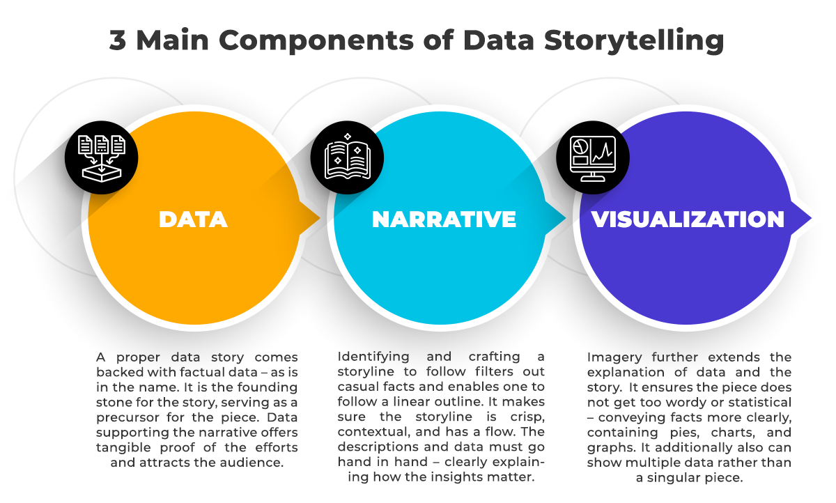
Data
A proper data story comes backed with factual data – as is in the name. It is the founding stone for the story, serving as a precursor for the piece. Data supporting the narrative offers tangible proof of the efforts and attracts the audience.
Narrative
Identifying and crafting a storyline to follow filters out casual facts and enables one to follow a linear outline. It makes sure the storyline is crisp, contextual, and has a flow. The descriptions and data must go hand in hand – clearly explaining how the insights matter.
Visualization
Imagery further extends the explanation of data and the story. It ensures the piece does not get too wordy or statistical – conveying facts more clearly, containing pies, charts, and graphs. It additionally also can show multiple data rather than a singular piece.
Key Benefits of Data Storytelling
1.Improves communication and decision-making
Data storytelling allows enterprises to communicate data insights to a wide range of stakeholders, including executives, customers, and different levels of employees. This enhances organizational communication, leading to better collaboration and more effective decision-making.
2.Holds a competitive advantage
In today’s data-driven business environment, enterprises that can effectively tell stories with their data have a competitive advantage. Data storytelling helps enterprises to make sense of the substantial amounts of data they collect and to communicate insights in a way that drives successful outcomes.
3.Enables better persuasion
Data stories can be a powerful tool for influence, mainly when dealing with stakeholders who are skeptical about change. By presenting data clearly and easily to understand, data stories can convince stakeholders of the value of a particular approach, action, or strategy.
4.Makes data more accessible
Data storytelling makes it easier for non-technical audiences to understand and interpret complex information. By transforming raw data into a meaningful narrative, data storytellers can help their audience better understand the insights and implications.
5.Creates impact
Data storytelling can significantly affect the audience, leading to positive action and change. Organizations that continuously work towards reducing their data literacy gaps and delivering more data stories within, have witnessed increased innovation, better productivity, and strategic wins.
Recommended Framework for Data Storytelling
Use the ‘right’ data
Not all data is created equal. Please choose the most relevant and impactful data to support your story, and make sure its accurate, relevant, and up to date.
Understand your audience
Learn more about your audiences – what they care about, what their background is, their level of awareness and exposure to the available insights.
Identify visualization formats
Humans are visual creatures, so use charts, tables, heatmaps, graphs, and other visuals that make it easy to interpret, access and consume. Draw attention to key information by establishing a visual hierarchy, using familiar jargons and distinguishable visual tones.
Create a compelling narrative
Streamline the various components of your storyline or pack of insights. Set the context by establishing a background, presenting the key information, revealing why they should care and what to do with it.
Engage and drive action
Enable conversations, thought exchanges and queries around the insights presented. Get your audiences involved in your data stories and help them stay focused on the big picture to take the necessary actions.
Role of Visualization in Data Storytelling
When telling a story with data, visualization helps to break down complex information, establish a relationship between various data points and provide a flow in which audiences can grasp the information. It allows data analysts and storytellers to simplify, de-clutter and communicate more convincingly.
There are a few valuable practices to keep in mind when creating visualizations for data storytelling:
1.Use the correct type of chart, table, or map to present your data. For example, use a scatterplot to show a relationship between two variables, a pie chart to show proportional values, and heatmaps to visualize density and cross-examine multivariate data points.
2.Avoid complex dashboards, layouts, and elements that could distract your audiences. Predictable, familiar formats that best express the information should be chosen to communicate the insights.
3.Aim to generate interactive visualizations that improve human-data interactions when presented. Its zooming, filtering, and brushing capabilities greatly help visualize large amounts of information and hold the audience’s attention.
4.Ensure your descriptive labels and titles are relevant, straightforward, and easily understood. While describing the purpose and meaning of every data figure is important, avoid crowding this space.
5.Colours aid in pattern recognition, better memory, and focus. Maintain consistency in picking the suitable colour scheme to differentiate strategically, establish associations, and clarify information
6.Ensure the visualization is accessible to a broad audience, including those with visual impairments, by providing alternative text, friendly colours, and other accessibility features.
7.Test the visualizations created with a sample audience size to ensure the insights are clearly communicated. Identify any gaps, invite feedback, and iterate to achieve the best version that drives maximum impact.
Use of Data Visualization Tools
Data analysts, scientists, and statisticians use various tools to process large data sets regularly and develop visual data models & insights. These popular data visualization tools come as low-code, no-code, online business intelligence platforms and code libraries that seamlessly integrate data, interpret, and automate the visualizations.
Popular Data Visualization Tools
1.Tableau
Allows users to create interactive visualizations, dashboards, and reports. It offers a drag-and-drop interface, making it easy for non-technical users to create visualizations.
2.Power BI
Offers data visualization, business intelligence, and data analytics tools for users to connect to multiple data sources, create visualizations, and share them with others.
3.D3.js
It is a JavaScript library for creating dynamic, interactive data visualizations in web browsers. It allows users to manipulate the data and create custom visualizations.
4.Google Data Studio
A free tool that allows users to create interactive dashboards and reports. It offers a drag-and-drop interface and integrates with multiple data sources.
5.QlikView
QlikView is a business intelligence and data visualization tool that allows users to create interactive dashboards and reports. It offers a powerful data engine and allows users to explore data in real-time.
6.Plotly
A data visualization library that allows users to create interactive charts, graphs, and dashboards. It supports multiple programming languages and can be used in web applications, desktop applications, and notebooks.
7.Microsoft Excel
A widely used spreadsheet program that offers basic data visualization capabilities. It allows users to create charts and graphs and can be a good option for simple data visualizations.
Popular Use Cases of Data Storytelling in an Organization
1.Sales Performance
Sales teams can use data storytelling to communicate sales performance metrics to leadership and senior business stakeholders. Using this criterion in sales management and forecasting eases the task, provides clarity, and analyses existing and potential trends with respect to revenue and conversion rates.
2.Financial performance
Finance teams can present persuasive and compelling insights on budgeting, expenses, investments, revenue, margins, returns, and the overall cash flow performance that help make data-driven decisions about ramp-ups, maintenance, and cut-downs. Data storytelling effectively makes sense of various financial datasets and communicates deeper insights to even non-finance audiences.
3.Recruitment and Performance
By creating interactive dashboards and multiple visualizations, the human resources teams can better map the effectiveness of recruitment channels, and analyze candidate quality, resource pipeline, and retention rates. It also makes identifying trends and anomalies easy across the employee lifecycle and assessing their productivity, compensation, and performance management.
4.Marketing
Marketing teams can effectively communicate insights from competitive analysis, customer engagement, and campaign performance to executive teams. This can be done by analyzing different metrics like market share, competitor strengths, consumer behavior, campaign reach, engagement, content formats, website performance, ROAS, etc. Translating marketing data from various sources into comparisons, distributions, correlations, and trends can help make data-backed decisions and marketing plans.
5.Project and Operations
Data storytelling is critical for project management teams to identify challenges, deliver solutions, and present outcomes that ultimately enhance the project’s success and client engagement. Understanding which data to consider, what actionable insights it leads to, its intended results, and how it’s presented to the audience are all critical steps in achieving process improvements and quality, managing project lifecycle, potential risks, opportunities, and growth.